Typeface comparison — not live
Shortcut lettering
All samples share the same card (170×81, radius 8) and the same font size. Only the family changes. Nothing here is connected to Home.
Approved mock — reference
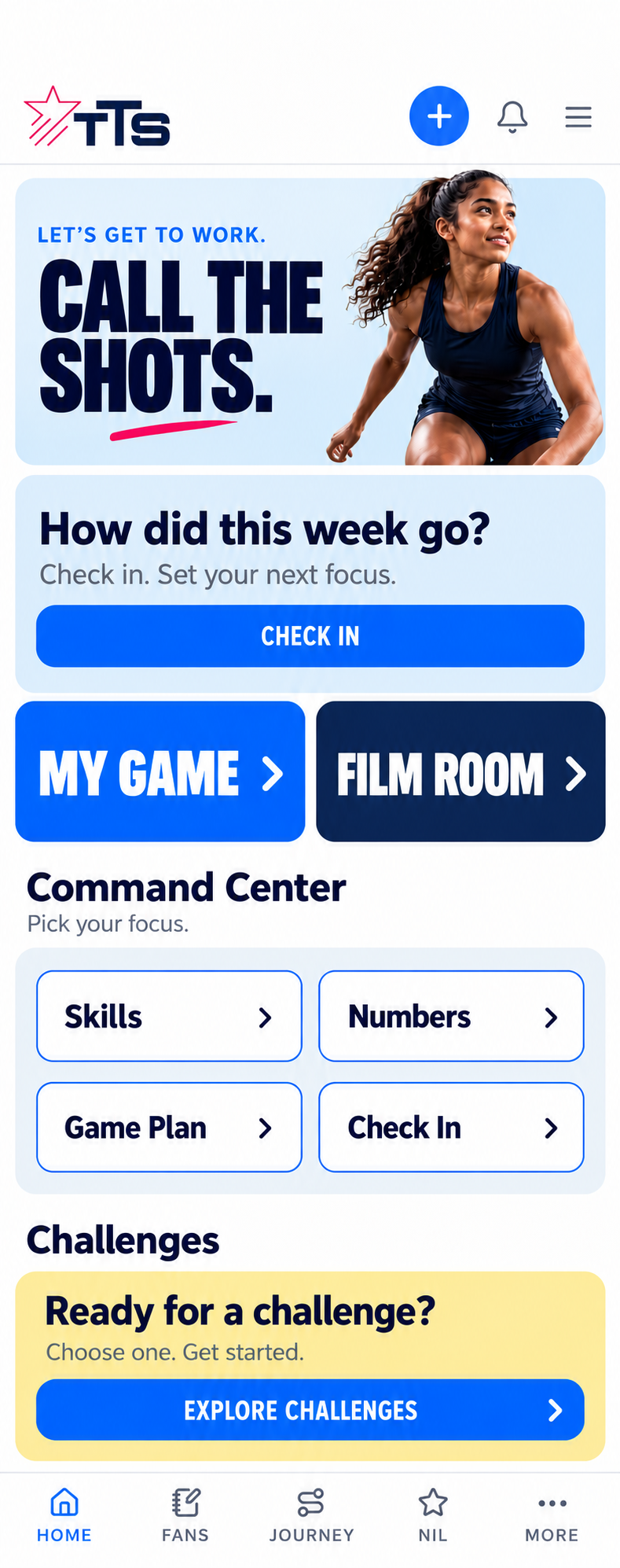
fills #0063FE / #0A2555 · cap 26.6 · MY GAME 115 · FILM ROOM 118.6 · radius ≈8
Anton vs the closest alternative — both at 31px
Anton
400 · current live face — closest match
cap 31px at 36px (0.86 em, tallest here) · width ÷ cap 4.13 / 4.87 vs mock 4.32 / 4.70
31px reproduces the mock's 26.6 cap height exactly
DIN Neuzeit Grotesk
700 · closest alternative
cap 27px at 36px (0.75 em) · width ÷ cap 4.26 / 5.11 — FILM ROOM runs 17px wider than the mock
needs 35px to reach the same cap height, and rounder letterforms
Why only two fit — all available faces at 36px
The text column is 122px. Mock targets: MY GAME 115, FILM ROOM 118.6.
- Gilroy161 / 192 · +39 past the column
- Neue Haas Grotesk Display164 / 196 · +42 past the column
- Helvetica Bold172 / 205 · +50 past the column
- Nunito174 / 210 · +52 past the column
- Avenir176 / 209 · +54 past the column
- Univers LT Std178 / 208 · +56 past the column
- Benzin232 / 271 · +110 past the column
Separately from the typeface, the mock differs from the live tiles in three measurable ways: card height 81 not 92, corner radius ≈8 not 16, and navy #0A2555 not the current #0C1E41 — plus one line per label (MY GAME, not MY GAME / PLAN). The bright blue already matches exactly.